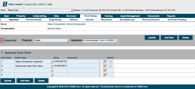
The Backshop user interface employs a set of simple, consistent objects to help you work more efficiently. This page explains those objects.
Note: Because Backshop is configurable per enterprise, your interface might look different. The interface is subject to change as we improve the application.
Click on an element to jump down to its description.
| Header | Comments |
| Navigation | Dates |
| Go to and Actions bars |
Plus boxes |
| Picker | Modules |
| Entry fields |
Header
1. Deal Locator: Takes you to the Deal Locator. Useful when you are managing a large number of deals.
2. Log out [username]: Logs you out of the application. Smart when you share computers with other people, or you log in from a different location. One huge benefit of Backshop’s Web interface is that you can log in anywhere with a connection. Yes, even on vacation.
3. Admin: Access administrative functions such as maintaining contacts, orgs and users, and establishing security groups.
4. Help: Takes you into Backshop’s help section.
5. Deal menu: Lets you quick choose from your most recently worked deals.
6. Deal info: Snapshot of key deal attributes.

Navigation
1. Tabs: The top-row tabs denote major sections of the application. Tabs are listed left to right in line with the primary deal flow. When you click a tab, you go to the primary page for that section, and that area’s sub-links are displayed.
2. Sub-links: The second-row links allow access to the major functions for the tab section. Clicking a sublink exposes the primary page for that section.
Note: Tabs and sub-links are customizable to help your enterprise operate as efficiently as possible.

Go to and Actions bars
If you’re not sure where to go from where you are, check out the Go to and Actions bars immediately below the navigation.
1. Go to: These links take you to interfaces directly related to your current location.
2. Actions: Key actions pertaining to your current location. Actions include importing and exporting.

Picker
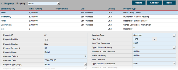
Backshop makes it easy to toggle among multiple properties or other entities. You can open or close the picker using the  arrows.
Picker closed: Switch entities using the menu.

Picker open: Entities are listed and key information is displayed. To select an entity, click on its name. The active entity is highlighted in light blue and exposed below the picker.
Entry fields
1. Read-only text has a gray background.
2. Editable text fields and form elements have light blue backgrounds.


Comments
To add a comment, click the ![]() icon.
icon.

A text-input window will pop up.
1. Enter your text. Format it using the WYSIWYG tools.
2. Click the Return text to Calling Screen button.
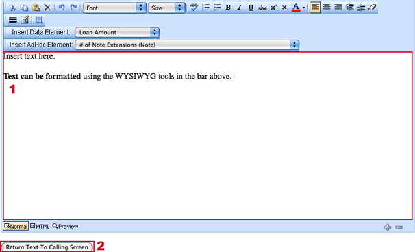
Your comment will appear in the comment box.

Dates
You can enter a date in two ways:
1. Simply enter text in MM/DD/YYYY format.
2. Click the ![]() icon.
icon.

Clicking the ![]() icon brings up a calendar interface.
icon brings up a calendar interface.
Find the date you want and click it.
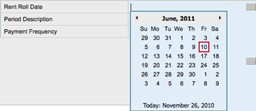
The date entry field will be populated.

Plus boxes
Plus boxes allow you to quickly add items from preset libraries.
Click the ![]() icon.
icon.

The ![]() icon brings up a window pre-populated with available choices.
icon brings up a window pre-populated with available choices.
Find the entry you want and click Select.
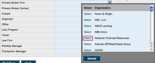
The field will be populated.

Modules
Backshop is organized into modules for clear organization and so you can manage your screen space. Hide and show modules using the  arrows.
Module open: Usual default.
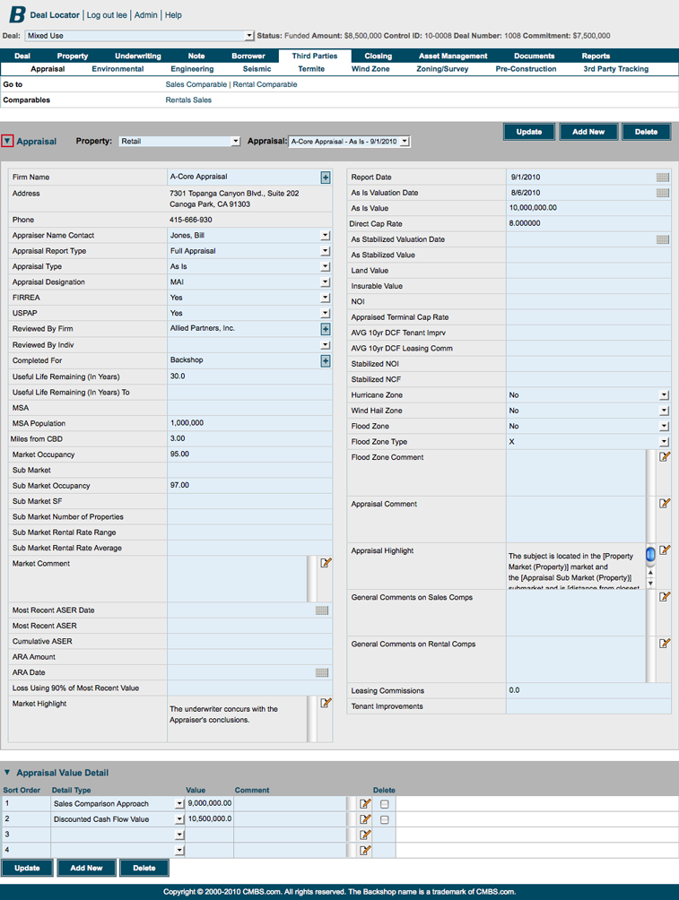
Module closed: Helps you focus on your immediate task.
